
My husband and I just recently moved into a brand new-to-us 1960s home in Virginia, and have spent the past month trying to make it feel like ours. Although organizing (and recycling all of those cardboard boxes!) was the priority, now that we are a little more settled, I’ve turned my attention to styling the surfaces in each of the rooms.
I’ve found that thoughtful styling goes a long way in making an unfamiliar house feel lived in and loved, and since I know I’m not the only one looking to nail the lived-in look, I’m sharing my tricks for making your surfaces feel naturally styled below—starting with a dresser!

Let’s begin by watching the entire progression from start to finish. First, I focused on art, and then moving on to accessories. As you can see from the animated images above, trial and error are all just part of the fun of styling a surface, so in your own house, take your time and step back often to consider the set up with a critical yet creative eye.

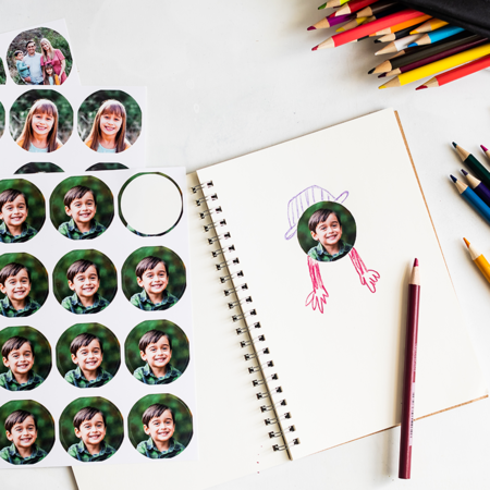
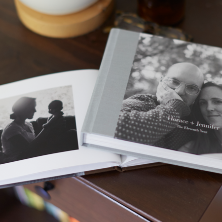
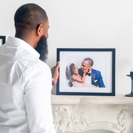
For the art, I started with a retro clock and an abstract print that I already owned. Then I ordered a few white-framed pieces from Pinhole Press to try out below the asymmetrically-hung pair of prints. The details in the first two framed collages in the top row of the grid above felt a little lost, as did the single framed photo in the bottom left of the grid. But the framed floral portrait felt just right when placed beside the abstract print. It offered the perfect amount of color and pattern when viewed from afar.
Don’t hesitate to change things up when you’re done with your own styling! You may have noticed that I nixed the retro clock at the very last second—this was because I felt like the cream-colored frame looked a little dirty next to the bright white frames of the other two pieces of art. In the end, I chose to throw in one more white-framed print. The brighter palette matched the other art better than the clock did, plus the horizontal orientation helped to break up the unintentional straight line that ended up forming between the left sides of the clock and floral print. Now the three pieces of art feel balanced and interesting!


Moving on to the lighting. With the asymmetrical arrangement of art off to the right, I knew that I needed something bold to balance out the dresser styling. In came three different lamps: first, a pink table lamp that felt too small, second, a tall lamp that was a little too thin, and finally a blue lamp that was tall enough and wide enough. I also loved how the blue color of the table lamp base “spoke” to both the blue abstract print and the framed flower photo off to the right.

 The most exciting—yet consequently, the most tricky—part of surface styling is your collection of accessories. Don’t be surprised if this phase of the setup takes the longest to nail. In fact, I always expect to start badly! The magic of styling only happens after tweaking and playing around with the things that you placed at the start, so experiment until it feels right.
In the top row of the grid above, I started with a pile of books. The first one was too short, whereas the second was too tall. So I eventually reduced the amount of books, and pushed them off to the right of the dresser surface.

In the bottom row of the grid, you’ll start to see everything come together—a simple framed photo, a pretty white and gold vase. To finish off the look, I snipped a leafy tree branch from our back yard, and plopped it into the vase. This last detail added some much-needed color to the left side of the setup, and the sculptural shape of the branch also helped to fill the empty wall space beside the lamp.

Acouple of final hints? Don’t feel like you have to line your books up edge to edge in a perfectly straight stack. Try pushing some of the middle books slightly askew so that they feel a little more natural. And always aim to work in groupings of three—two feels too few, and four often feels too forced. An odd number like three (and sometimes five) will allow you to achieve an intentionally collected vibe without seeming like you’re trying too hard.

In the end, it all comes down to a quest for balance, so try styling one section, step back and squint your eyes. If your styled surface feels too heavy on one side or too wimpy overall, scale back (or beef up!) your art and accessories and step back once more to evaluate. In no time, you’ll nail the intentionally styled look and your home will feel sweeter and more stylish than ever.


About the Author
A self-proclaimed New Yorker from the Midwest, Rachel Castro lets design and color inspire her everyday life. Designer by day and DIYer by night, you can follow all of her latest projects on Digs & DIY, where she documents her favorites from recipes to redesign.